Project: Solo Project
Role: Product Designer
Skills: Research, Design, Prototyping
Tools: Figma, Claude Code, Notion
From organized syllabi to proactive course awareness - and learning that efficiency isn't the same as value


"It's in the syllabus" - every student's dreaded professor response.
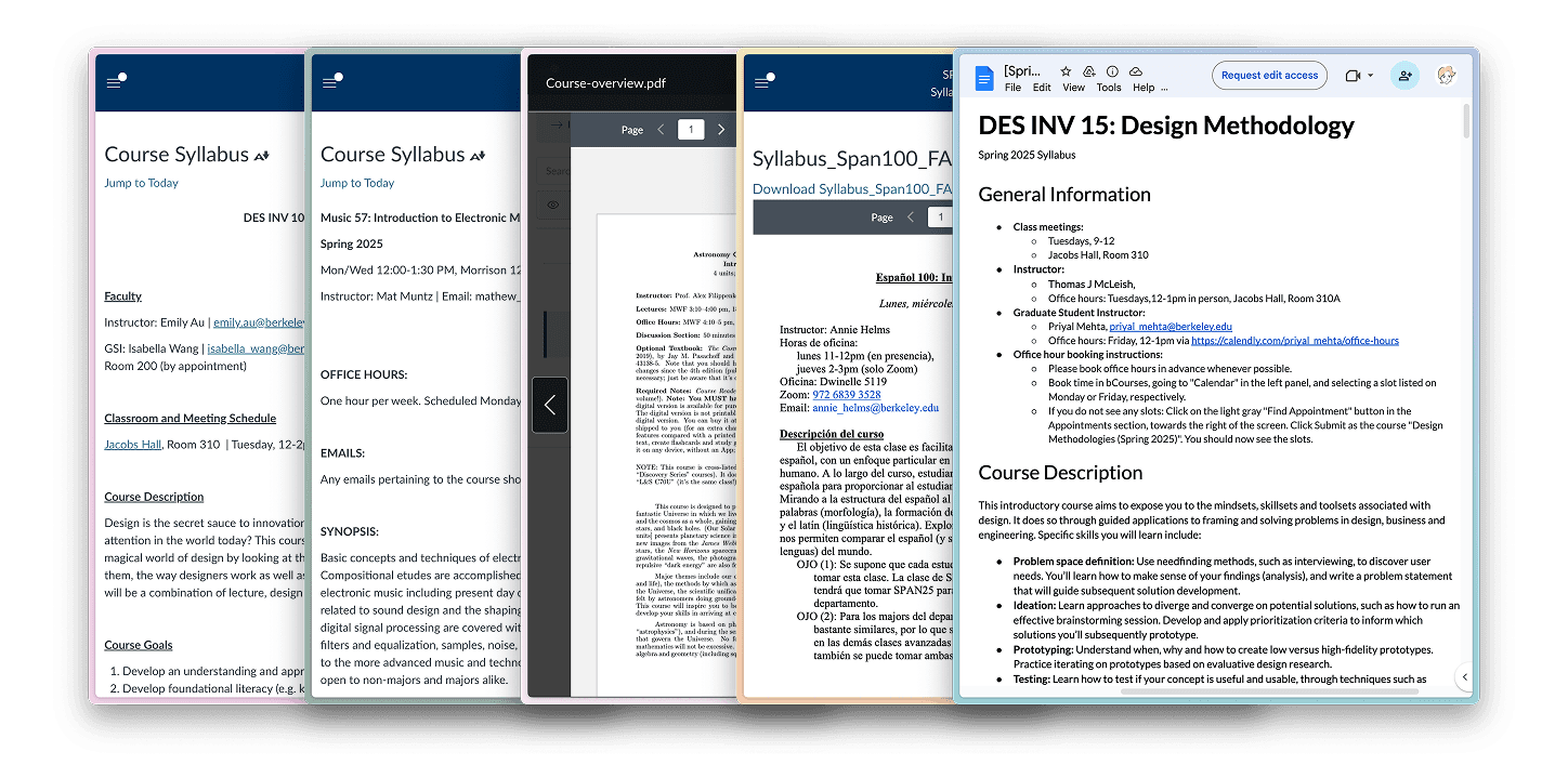
Students check syllabi constantly. Due dates, grading policies, office hours. But course info is scattered across PDFs, Canvas pages, and Google Docs - and no two syllabi are formatted the same. Testing showed that finding a single detail takes 25-40 seconds of scrolling and scanning.
But the real cost isn't time, it's cognitive effort and stress. Every lookup requires holding your goal in working memory while visually searching through inconsistent layouts. You’re digging for the syllabus, scrolling, scanning, hoping to find what you’re looking for - and often in a rush.

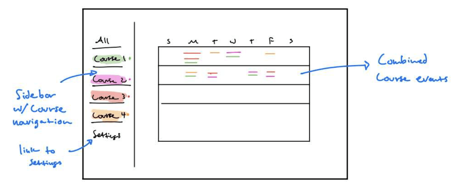
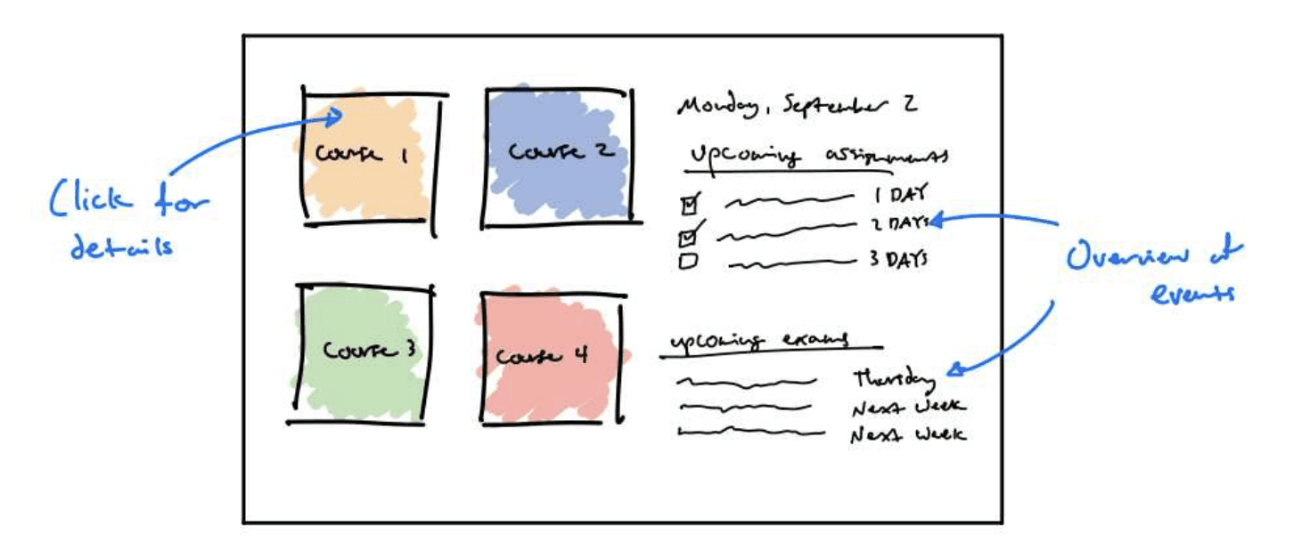
Version 1: Organization
The first version parsed syllabi into a structured hub with tab-based navigation. Upload once, then reference quickly through consistent categories: Calendar, Course Info, Contacts, Office Hours.
V1 solved the efficiency problem. Lookups dropped from 25-40 seconds to under 8 seconds - an 82% improvement. The consistent structure meant you always knew where to look.
But it didn’t address the fundamental friction. Users thought it was cool, but it was clear the value wasn't there.
Iteration & Improvement
Even with better organization, V1 still asked too much from users:
Initiation cost - you had to know to look. The tool was reactive, waiting for you to begin searching for information. Unless you committed to looking, V1 wasn’t much help.
Search cost - you had to know where to look and then find it. V1 was much faster than a raw PDF, but you were still navigating categories and scanning tiles to locate specific info.
It improved efficiency, but it didn’t innovate on the syllabus experience very much.
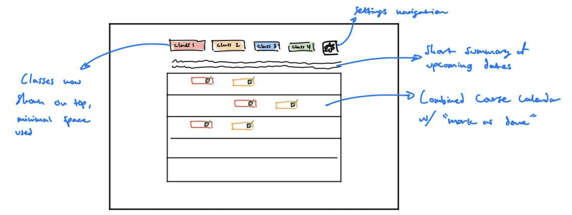
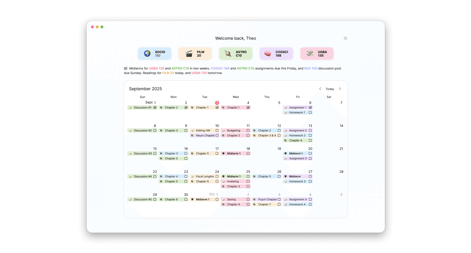
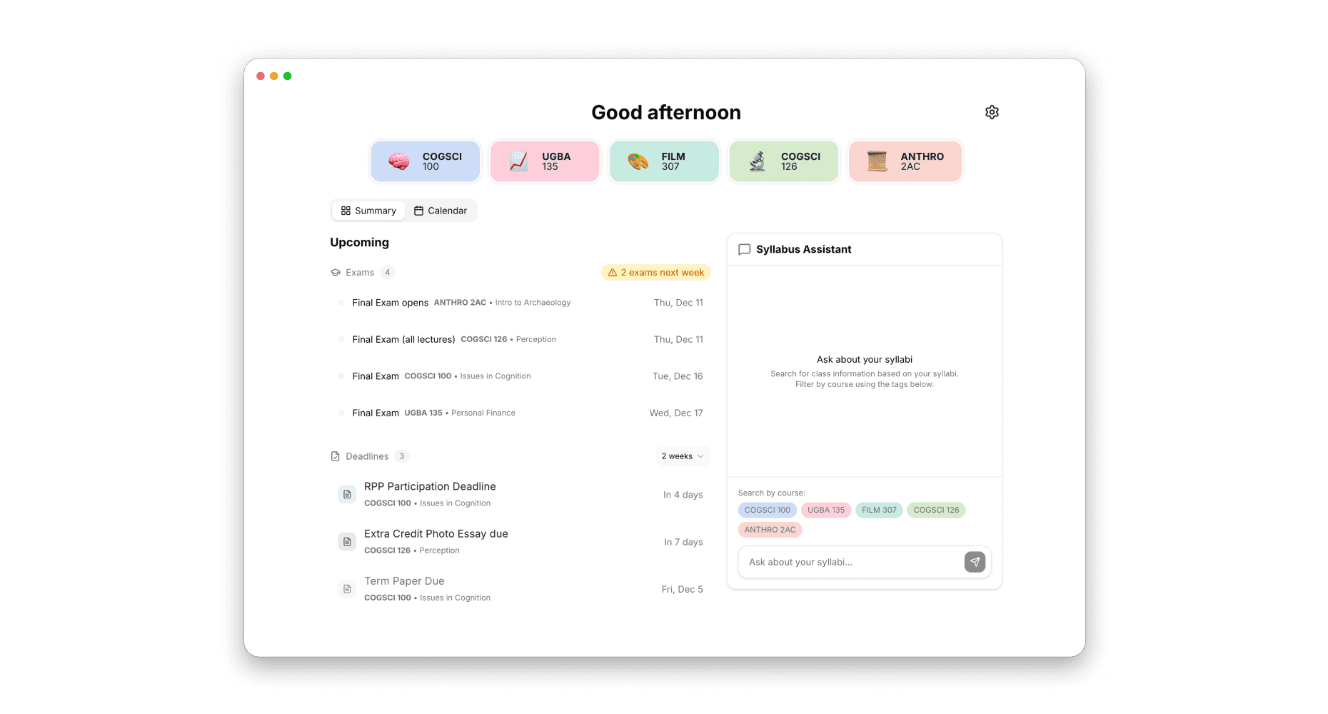
Version 2: Proactivity
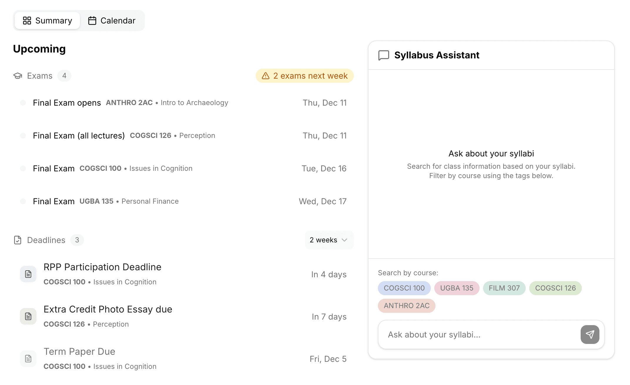
The redesign improves on the core experience. Instead of waiting for you to search, SyllabusHelper now surfaces what matters and lets you ask instead of hunt.
Two tabs on the homepage:
Summary - a dashboard that comes to you
Calendar - the original aggregated view, still there when you need it
The Summary tab has two columns -
Upcoming
No more checking the calendar and hoping you notice what's important. Upcoming organizes your near-term events into two sections:
Exam Radar - when your next exams are, how far out, how many total
Deadlines - assignments, projects, homework due in the next two weeks (exams excluded so they don't clutter the list)
This eliminates the initiation cost of looking for important events. You don't need the foresight to check for a due date - it's already there.
Syllabus Assistant
Instead of navigating tabs and scanning tiles, you just ask and the assistant finds and surfaces the answer.
Course pills at the bottom let you quickly scope your question - click a pill and an @ mention appears in the text field. Or just mention the course naturally.
This eliminates search cost. You don't need to know where information lives or scan to find it.
Reflection
Efficiency isn't the same as value
V1 made syllabus lookups 82% faster, but users didn’t adopt it. This helped me realize that the product wasn’t providing enough value to really solve the problem. All I was doing was reducing friction, but the interaction model was still fundamentally reactive. People don't want to get better at searching for course info, they want to stop thinking about it until it matters.
Proactivity changes the relationship
The shift from V1 to V2 changed what the tool does for you. V1 said "here's your info, organized." V2 says "here's what you need to know right now." This is a different value proposition that’s more aligned with what students actually want.
Currently collecting feedback on V2 to see if this version earns a place in real workflows.
Product Evolution