Project: 0→1 Product
Role: Project Manager → Product Designer
Skills: Multi-User Systems, Product Design, Prototyping
Tools: Figma, Notion
Designing for three user types in one system, and learning when interfaces need to split rather than stretch

The Challenge
SAT academies in Korea manage 50-200+ students across dozens of classes using Google Sheets and manual processes. Teachers spend 8-10 hours per week on administrative tasks (attendance tracking, parent billing, schedule coordination) that pull them away from teaching.
Fragmented information creates errors: scheduling conflicts, duplicate data entry, lost student progress. Möbius aimed to centralize everything - diagnostics, scheduling, and roster management - into one platform for students, teachers, and admins.
The complexity: Three user types with overlapping but distinct needs. One system that has to serve everyone.
Möbius V1
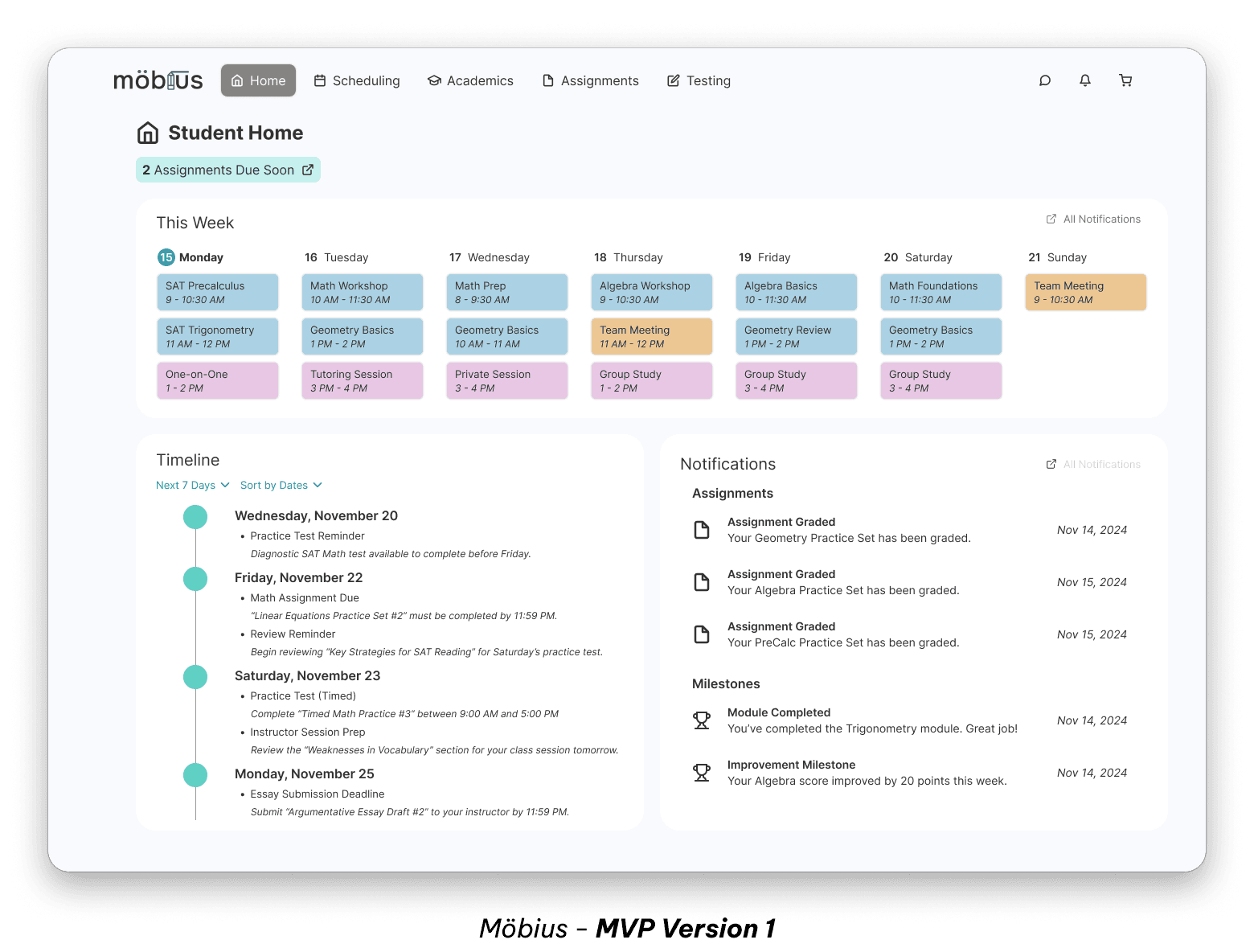
The first version centralized everything into one interface - scheduling, diagnostics, rosters, student progress, all accessible from the same navigation. It covered the core functionality, but introduced some issues.
Users were struggling to context-switch. Academic tasks and admin tasks lived side by side, which meant constant mental gear-shifting. The interface was trying to serve every need at once, and the cognitive cost showed.
Two Solutions
Mode Switching for Teachers
The original interface had too many options competing for attention. No clear sense of "what am I doing right now" - just a wall of features.
The fix - a toggle that switches between two distinct interfaces.
Academic View: Lesson planning, student progress, diagnostics
Operations View: Schedules, logistics, finances, rosters
Each mode has its own navigation and color scheme. You're either in teaching mode or admin mode, never both. The switch is fast and satisfying, but more importantly, it matches how teachers actually think about their work.
Smart Roster Selection
Managing student schedules means understanding relational data: which classes a student is in, when they meet, who overlaps with whom. Traditionally, this requires toggling between pages and holding information in your head while you cross-reference.
The fix - a compact roster view that shows students and their schedules in one place.
Each student row includes:
Enrolled classes (as clickable tags)
Weekly schedule (visual timeline)
Clicking a class tag filters to show that class's schedule. Selecting multiple tags reveals overlaps. All the cross-referencing happens in one view - no page-hopping, no mental juggling.
Role Evolution
Phase 1: Leading 5 designers
Led a semester-long design contract to build the MVP. I personally designed core pages (dashboard, student progress tracking, assignment management) while coordinating the full team across competitive research, wireframing, and design system creation.
Delivered: Functional prototype of all core features: home, scheduling calendar, student progress tracking, assignment management, testing interface.
Phase 2: Solo Redesign
The client brought me back independently to address what we'd learned. This time I was the only designer, focused on solving the specific UX problems that emerged from real usage. That's when I designed the mode switching system and smart roster.
Reflection
One user with multiple identities
The mode-switching solution came from client and user feedback on V1. The core lesson is that any user might have different identities at different times, each with their own goals and mental context. Designing for "teachers" is too vague, we needed to design for teachers-as-educators and teachers-as-administrators separately.
This perspective applies to any multi-user system: complexity can come from multiple users and one user who wears multiple hats.
Designing around working memory limits
The smart roster solution came from a simpler insight: working memory is limited. Cross-referencing information across pages means holding things in your head while you navigate, which is exactly the kind of cognitive load that causes errors and frustration. Putting everything in one interactive view respects how memory really works.
This principle made its way into my general design thinking. If users have to hold something in their mind while doing something else, the product is asking too much.